Plotting Cumulative Returns#

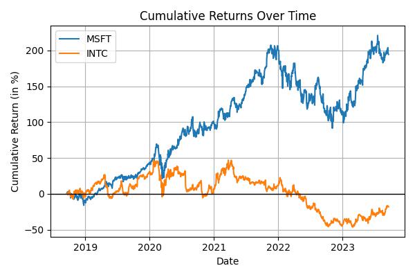
This guide continues from the previous example. We will retrieve financial data using MoabDB and how create a chart of cumulative returns using the matplotlib library.
We’ll be using the get_equity function to retrieve daily-level and show how to plut cumulative returns for multiple stocks.
Prerequisites#
You will need matplotlib installed. If you haven’t already, you can install it with:
pip install matplotlib
First, let’s retrieve some financial data. For this example, we’ll fetch historical closing prices for a given stock (e.g., MSFT):
Import MoabDB and fetch data#
import moabdb as mdb
import matplotlib.pyplot as plt

# Constants defined here for flexibility
TIC = 'MSFT'
SAMPLE = '5y'

# Load and Check Data
data_df = mdb.get_equity(tickers=TIC, sample=SAMPLE)
print(data_df.head())
Plotting Cumulative Returns for Multiple Stocks#
To visualize the performance of various stocks over time, we’ll compute and plot their cumulative returns. Mathematically, the formula for cumulative returns is:
Which is that every price is divided by the initial price and then subtracted by 1. This gives us a percentage that we can plot over time.
Compute and Visualize Cumulative Returns with Matplotlib#
We can easily calculate cumulative return as price t divided by the initial price, and then subtracting 1 Let’s compute this for our stocks:
import moabdb as mdb
import matplotlib.pyplot as plt

# Constants defined here for flexibility
TICS = ['MSFT','INTC']
SAMPLE = '5y'

# Load and Check Data, Get Prices
data_df = mdb.get_equity(tickers=TICS, sample=SAMPLE)
price_df = data_df['Close']
print(price_df.head())

# Calculate the cumulative returns
price0 = price_df.iloc[0]
cum_returns = (price_df[TICS] / price0[TICS]) - 1
cum_returns *= 100

# Creating the plot
fig, ax = plt.subplots(figsize=(6,4))
for tic in TICS:
    ax.plot(cum_returns.index, cum_returns[tic], label=tic)

ax.set_title('Cumulative Returns Over Time')
ax.set_xlabel('Date')
ax.set_ylabel('Cumulative Return (in %)')
ax.axhline(y=0, color='black', linestyle='-', linewidth=1)
plt.grid(True)
plt.legend()
plt.tight_layout()
plt.show()

With these simple steps, you’ve fetched financial data using MoabDB and visualized it with a basic chart. Explore more with different stocks, date ranges, or chart types to gain richer insights!
